32 Bowls, 32 Logos - Part 4
This is the final part of a 4-part series where we evaluate the bowls based on their logos. "We" is myself, an 11-year veteran of the advertising business and Alex (the expert), a professional colleague who is a creative director that came out of the graphic design and art direction end of the ad business. Alex is a contributor at the popular South Florida blog called Stuck on the Palmetto.
Part one is here
Part two is here
Part three is here
25. The Capital One Bowl This bowl game used to be called the Citrus Bowl. Steve Spurrier once famously remarked that you can't spell citrus without U-T, making fun of Tennessee's inability to break into an SEC championship game and get a shot at a major bowl. This logo clean and quickly tells you all you need to know. The sun and the palm tree are a nice touch.
The Experts Says: Very nice. Some detail on the palm tree would have been appreciated but overall good effort.
Overall Grade: A-
26. The Rose Bowl presented by Citi The Rose Bowl is the "Grandaddy of them all", the oldest bowl game in college football. You can tell that they feel strongly about it because the central icon of the Bowl hasn't changed in many years. I guess they didn't want to contaminate it. Instead they add elements around it. Just seems like a bunch of disconnected items. The font for the name of the Bowl is common and doesn't inspire me.
The Expert Says: Uh, I think we did some preliminary designs a while back for the Rose Garden Show? All we’ll have to do is change the name.
27. The Tostitos Fiesta Bowl![]() I've always liked this one. The key element is the sponsor logo, which in and of itself is very clever. Have you ever looked at it closely. The two "T's" are people dipping the chip in the salsa-filled dot on the "I". Minus points for leaving the "Brand Tortilla Chips" under the word "Tostitos". It's tiny and could have been ommitted. I also like the Sun made of tortilla chips. Very clever since the Phoenix area is known as "the Valley of the Sun" The "Fiesta Bowl" font is wacky and fun, just like those Mexicans who want to come over the border just to drink at their "Fiestas".
I've always liked this one. The key element is the sponsor logo, which in and of itself is very clever. Have you ever looked at it closely. The two "T's" are people dipping the chip in the salsa-filled dot on the "I". Minus points for leaving the "Brand Tortilla Chips" under the word "Tostitos". It's tiny and could have been ommitted. I also like the Sun made of tortilla chips. Very clever since the Phoenix area is known as "the Valley of the Sun" The "Fiesta Bowl" font is wacky and fun, just like those Mexicans who want to come over the border just to drink at their "Fiestas".
The Expert Says: Pretty good, not very footbally, but will do.
Overall Grade: A-
28. The Fedex Orange Bowl![]() The Orange Bowl game is no longer played in the Orange Bowl and this logo should no longer be the Orange Bowl logo, it's older than dirt. I like the "King Orange" element but an updated shield and font for the words "Orange Bowl" are needed. Something that tells me it's a football game would be nice too.
The Orange Bowl game is no longer played in the Orange Bowl and this logo should no longer be the Orange Bowl logo, it's older than dirt. I like the "King Orange" element but an updated shield and font for the words "Orange Bowl" are needed. Something that tells me it's a football game would be nice too.
The Expert Says: A classic in need of a redesign
Overall Grade: C
29. The Allstate Sugar Bowl. I like it despite the fact that it's not very footbally and doesn't imply Sugar or New Orleans anywhere.
The Expert Says: Red, Blue and Silver is nice when used in the appropriate shades (see Chick-fil-A). When it’s all dark like this, then it’s just gloomy.
Overall Grade: C+
30. The International Bowl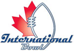
I've never heard of this thing. Must be being played on a 110 yard field with only 3 downs and 20 yard end zones, right? Wrong. It's being played in Toronto, silly. Of course we had to have the Maple leaf in there. Are Canadians known for anything else? Well I guess a hockey stick wouldn't make sense on this logo. I like the football element but the font makes it look like it's an auto race for some reason.
The Expert Says: Just horrible. The font is 50’s Americana and the Canadian symbol is just thrown in there.
Overall Grade: D
31. The GMAC Bowl Oddly they didn't take the underlining from the GMAC logo over to the word Bowl, leaving a weird empty space on the banner. I don't know what the red disk is behind it, some sort of manhole cover? I worked for a company that had a subsidiary with a night skyline in its logo like this. Bad memories. Is that what Mobile is supposed to look like? And why are they playing these crappy bowls after New Year's. Be gone! Back to Christmas week with all the other lesser bowls and logos I command you!
The Expert Says: Why is GMAC underlined? Why is the football laying on a Webber grill?
Overall Grade: D-
32. The Tositos BCS Championship Game. What, sponsoring one major Bowl ain't enough for you Tostitos? This is the first year of this new bowl which apparently will not be permanently held in one location. They had a blank canvas and a chance to make a statement about the biggest game in college football. They failed. At least they didn't try adding "Brand Tortilla Chips" in microscript letters under the word "Tostitos"
The Expert Says: I think there are two or three fonts left they didn’t use. Ugly colors too. A mess.
Overal Grade: C+
Well that's it. Next year we'll see what new Bowl games they add and who changes their logo or sponsor.


 Mentioned in Austin Murphy's book


1 comment:
The Fiesta Bowl has always been my favorite logo. The Tostitos logo was implemented in such a way that it isn't an eye sore to the bowl logo like all the other bowl logos.
I still like the Orange Bowl though...
-Shlomo
Post a Comment